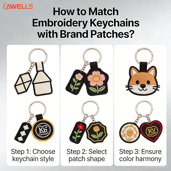
Align Brand Identity Across Embroidery Keychains and Patches
Color Matching: Balancing Thread Constraints with Brand Palette Fidelity
Getting consistent colors right when making embroidered keychains and patches really comes down to knowing what threads can actually do. Most standard embroidery threads only have around 600 to 800 color choices, which pales in comparison to the massive selection of over 1,800 shades found in Pantone color books. This creates a real problem for matching exact colors. Experienced designers work around this limitation by focusing on the main brand colors that are commonly found in big thread collections like Madeira or Isacord. They often go for bold contrasts such as white thread on dark gray fabric rather than trying to replicate subtle gradients or slight color variations that just won't look right once stitched. Special digital color matching software helps too, especially when it's calibrated properly under standard D50 lighting conditions. These tools cut down on color mismatches so everything looks cohesive across different promotional products, without leaving everything up to guesswork.
Logo Translation: Simplifying Complex Logos for Small-Scale Embroidery Keychain Legibility
When shrinking down to something like a keychain, complex logos just don't hold up well below about 2 inches. To fix this, designers should cut out those super thin lines thinner than 1mm, switch any small text under 8 points to bold sans serif typefaces such as Arial Bold or Helvetica Neue, and focus more on using empty spaces between elements rather than relying on tiny details. Some research in the clothing industry actually showed that people recognize these simpler versions of logos around 63 percent better when they're really small. Think about what makes brands instantly recognizable anyway. The Starbucks logo works because everyone knows that mermaid shape without needing all the extra stuff around it. Same goes for Nike's famous swoosh mark. Instead of adding fancy backgrounds or multiple layers, stick with those main shapes that immediately scream the brand name. Doing so keeps the brand identity intact even though the actual size limits what can be embroidered properly.
Values Embodiment: Using Symbolism and Stitch Choice to Reinforce Brand Voice
Stitch techniques convey brand personality through tactile storytelling:
- Satin stitches (smooth, reflective) signal luxury for premium brands
- Fill stitches (dense, textured) imply durability for outdoor or workwear companies
- Chain stitches (ribbed, dimensional) suggest artisanal craftsmanship or heritage
Using a leaf design made from matte green threads dyed using eco-friendly methods really drives home sustainable values. Tech companies tend to mix geometric shapes with shiny or conductive threads when they want to suggest cutting edge ideas. The way stitches are packed together matters more than extra graphics for showing what makes a brand special. Take tighter stitching around the main part of a logo as an example it quietly shows attention to detail without making things look messy. Companies that make sure their embroidered designs match what they stand for generally find people remember them better. Some studies show around 40 percent improvement in recall rates when there's this kind of connection between what gets stitched and what the brand actually represents.
Maintain Visual Consistency in Embroidery Keychain and Patch Production
Stitch Density, Fabric Base, and Dimensional Harmony Between Items
Keeping stitches at a consistent density around 0.4 to 0.6mm works best when we want those fine details to show through without looking off balance between our patches and embroidered keychains. When making these items, getting thread tension right matters a lot. The backing stuff too - think twill or felt materials need to match up along with similar fabric thicknesses. For instance, if we have a twill patch measuring 1.3mm thick, it makes sense to pair it with something close like a 1.4mm substrate on the matching keychain so they don't look different in weight when placed together. Same goes for using the exact same backing material throughout both products because this stops colors from bleeding into each other while keeping everything structurally sound. Factories that calibrate their machines properly see about an 18% drop in production errors according to industry reports from last year.
| Parameter | Keychain Specs | Patch Specs | Alignment Strategy |
|---|---|---|---|
| Stitch Density | 0.4–0.6mm | 0.5–0.7mm | Standardize digitization files |
| Fabric Thickness | 1.2–1.5mm | 1.3–1.6mm | Use identical backing material |
| Color Tolerance | ΔE≈2.0 | ΔE≈2.0 | Batch-dye threads together |
Uniform Typography, Icon Scaling, and Negative Space Treatment
Getting typography right at scale matters a lot for embroidery work. We recommend keeping embroidered text at least 8 points in size. Stick to bold sans-serif fonts like Arial Bold since most digitizing programs support them well. When scaling icons, always do it proportionally relative to the main logo design, not separately. The negative space around elements needs at least 0.3mm clearance between stitches to avoid overlaps and keep everything looking neat. For preparing digital files, aim for 1200x675 pixels when working on designs smaller than 1.5 inches. Apply some anti-pull compensation too, usually around 5 to 8 percent stretch allowance works best. Make sure those digitized files have transparent backgrounds so there aren't any accidental stitches appearing where they shouldn't. All these little details help maintain sharp lines and prevent weird distortions when running through the embroidery machine later on.
Maximize Brand Impact with Strategic Embroidery Keychain Integration
From Functional Accessory to High-Touch Brand Touchpoint: Psychological and Behavioral Benefits
When brands embed embroidered keychains into their marketing strategy, these little accessories go way beyond being just functional objects. Unlike those throwaway pens or magnets people get at conferences, embroidered keychains create real connections because folks actually touch them every day. Studies have found that people who keep these items around remember brands better than those who only see ads online – some research even points to about 47% better recall rates. Every time someone clips one onto their bag or takes it off to grab something else, it's reinforcing what the brand stands for in their mind. Plus, since keys tend to move around so much, going from office drawers to gym bags during commutes, the keychain gets seen by lots of different people without anyone trying to promote it. Designing for such a small space might seem challenging at first, but this constraint actually helps focus the brand message into something memorable that sticks with consumers on multiple levels.
Build Scalable, Modular Embroidery Keychain and Patch Systems
Setting up scalable production systems for things like embroidered keychains and brand patches lets companies grow their product offerings without losing control over how designs look. The modular approach works because it builds on already approved components. Think about standard thread colors that match Pantone charts and what the big thread makers recommend. Then there are fabric choices such as plain old cotton twill or eco-friendly recycled polyester felt. And don't forget all those different stitch patterns we've got stockpiled satin stitches, fill stitches, chain stitches, and those fancy edge treatments. According to some industry research, this method cuts down waiting periods by around 30 to maybe even 50 percent compared to making everything from scratch each time. When sales spike during holiday seasons or when launching new products, manufacturers just mix and match tested elements instead of starting over completely. Take a company logo for example it shows up exactly the same way on both keychains and patches with matching thread counts, borders, and stitching underneath so customers instantly recognize it. Want to tweak designs for different regions? Just swap out snowflakes for cactus symbols in hot climates without changing anything else about the brand identity. This kind of flexibility keeps warehouses running smoothly and makes sure the brand looks consistent everywhere it appears.
FAQ
What are the main thread collections used for color matching?
Designers commonly use Madeira and Isacord threads for color matching, as these collections contain a wide range of colors that align with brand palettes.
How can complex logos be adjusted for small-scale embroidery?
Simplifying complex logos involves removing thin lines, using bold sans-serif fonts for small text, and focusing on mainstream shapes that represent the brand identity.
What stitch techniques can convey brand personality?
Satin stitches suggest luxury, fill stitches imply durability, and chain stitches denote artisanal craftsmanship.
What is the recommended stitch density for embroidery keychains and patches?
The recommended stitch density ranges from 0.4 to 0.6mm to maintain detail without imbalance.
How do embroidered keychains enhance brand recall?
Embroidered keychains enhance recall through daily tactile interaction, leading to better brand recognition compared to passive ads.