Aviation-Authentic Design Principles for Remove Before Flight Keychains
Why Red Fabric, Bold Typography, and Minimalism Define Aviation Credibility
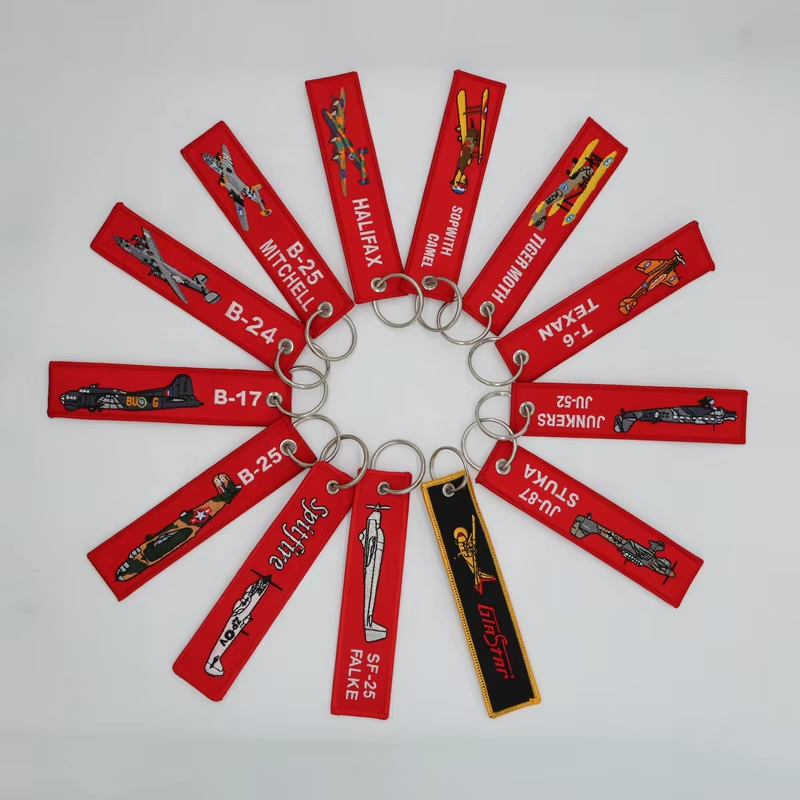
Authentic remove before flight keychain design adheres strictly to aviation safety standards. High-visibility red fabric is non-negotiable—it signals immediate attention in hangars and flight decks worldwide, a convention rooted in military and commercial aircraft protocols where red tags prevent catastrophic oversights. Bold, sans-serif typography ensures instant legibility during pre-flight checks, even in low-light or high-stress conditions. Minimalism completes the trifecta: cluttered designs distract from the core warning function. Aviation professionals prioritize function over form—extraneous graphics, secondary text, or decorative flourishes compromise clarity. This disciplined adherence transforms a simple keychain into a trusted, operationally credible safety tool.
Case Study: Balancing Compliance and Brand Appeal
A major airline recently redesigned its flight safety keychains after ground crew reported readability issues with the original version, which used corporate blue accents and intricate logos—violating aviation’s universal “red-only” expectation for critical warnings. The redesign prioritized:
- Monochrome red fabric meeting FAA reflectivity standards
- Oversized Helvetica font for maximum legibility
- Brand expression reduced to a subtle, monogrammed aircraft silhouette on the reverse
Post-implementation surveys showed 89% faster tag identification during safety audits. The airline preserved brand identity while reinforcing operational trust—demonstrating that compliance and aesthetic cohesion are not mutually exclusive, but mutually reinforcing when grounded in aviation tradition.
Optimizing Visibility and Legibility with High-Contrast Color Standards
Red-on-White as a Universal Safety Signal — Origins and Industry Expectations
Red has long signaled danger and urgency across global aviation systems; white provides the highest possible contrast against red, enabling instant readability at distance and in suboptimal lighting. This pairing isn’t stylistic—it’s codified in decades of safety signage standards, including ICAO Annex 14 and FAA Advisory Circular 150/5340-1L on airport visual aids. Crews rely on this consistency to identify critical items without hesitation. A professional remove before flight keychain mirrors this standard: deep red fabric paired with crisp white typography ensures rapid recognition against dark flight suits, cockpit panels, or hangar shadows—eliminating ambiguity and supporting split-second decision-making.
Applying Adapted WCAG Contrast Principles to Physical Keychain Materials
While WCAG guidelines were developed for digital interfaces, their contrast principles offer a rigorous, evidence-based benchmark for physical safety products. WCAG requires a minimum contrast ratio of 4.5:1 for normal text and 3:1 for large text (18pt+ or bold 14pt+). In practice, white polyvinyl lettering on deep red nylon consistently exceeds a 7:1 ratio—surpassing even WCAG AAA standards. However, real-world variables—fabric texture, surface glare, UV fading, and repeated handling—can erode perceived contrast over time. Designers must validate samples under operational conditions: bright sunlight, dim cockpit lighting, and post-wear abrasion testing. Low-contrast combinations—including light red on dark red, yellow on red, or off-white on brick red—are strictly noncompliant and must be excluded.
Layout Discipline: Hierarchy, Branding, and Strictly Prohibited Elements
A professional remove before flight keychain demands a strict visual hierarchy to convey credibility instantly. The iconic red “REMOVE BEFORE FLIGHT” warning occupies primary visual weight—centered, unbroken, and dominant. Brand identity, if included, functions as a secondary anchor: small, monogrammed, and placed deliberately—typically on the reverse or as a discreet embossed element on the tag’s edge. Manufacturing marks, material certifications, or compliance codes belong solely on the backside or integrated into the strap’s seam—not the front-facing warning surface. Overloading the front with decorative borders, gradients, icons, or layered typography violates the minimalist discipline pilots and ground crews depend on. Every element must earn its place through functional necessity—not marketing intent.
The Zero-Tolerance Rule: Why URLs, QR Codes, and Contact Info Break Aviation Authenticity
Authentic remove before flight keychains never include web addresses, QR codes, phone numbers, email addresses, or social media handles. These elements introduce commercial noise, disrupt visual hierarchy, and undermine the item’s implied role as a purpose-built safety accessory—not a promotional giveaway. In aviation culture, authenticity is signaled by restraint: anything that doesn’t directly support the warning’s urgency or reinforce brand credibility through subtlety compromises perceived legitimacy. The rule is absolute—endorsed by industry veterans and reflected in OEM specifications from Boeing, Airbus, and Honeywell: if it doesn’t contribute to safety communication or trusted brand recognition, it has no place on the front face.
Production-Ready Specifications: Dimensions, Materials, and Durability
A production-ready remove before flight keychain must meet stringent dimensional, material, and durability requirements to perform reliably in demanding aviation environments. Standard dimensions include a 1-inch-wide, 6–8-inch-long woven nylon strap (minimum 1000 denier) for abrasion resistance, UV stability, and moisture wicking. The rectangular tag measures approximately 2 × 3.5 inches and is molded from impact-resistant polycarbonate or ABS plastic, with a minimum thickness of 2 mm to prevent cracking under repeated flexing or impact. All metal hardware—including the split ring or screw-lock carabiner—must be stainless steel (e.g., 304 or 316 grade) or zinc-alloy with corrosion-resistant plating. Finished units undergo certified testing: a 50-lb static load test on the strap and a 20-lb pull test on the ring attachment—ensuring structural integrity across daily use on the flight line, in maintenance bays, and aboard aircraft.
FAQ
Why is high-visibility red fabric crucial for remove before flight keychains?
High-visibility red is an industry standard because it signals urgency and draws immediate attention during pre-flight checks. It minimizes the risk of oversight in critical situations.
What typography is used on these keychains?
Bold, sans-serif typography such as Helvetica is typically used to ensure instant legibility, even in low-light or high-stress conditions.
Can branding compromise the functionality of these keychains?
Effective designs balance functionality and branding by placing minimal branding elements, like monograms, on the reverse side while keeping the warning text uncluttered and dominant.
Why are URLs and QR codes discouraged?
These elements introduce visual noise and detract from the primary safety message. Authentic aviation tags focus solely on conveying critical warnings.
What materials are commonly used for these keychains?
Woven nylon (minimum 1000 denier) and impact-resistant polycarbonate or ABS plastic are used for their durability in demanding environments.